For a university, the website is the first impression, and for prospective students and their parents, it’s the trust test.
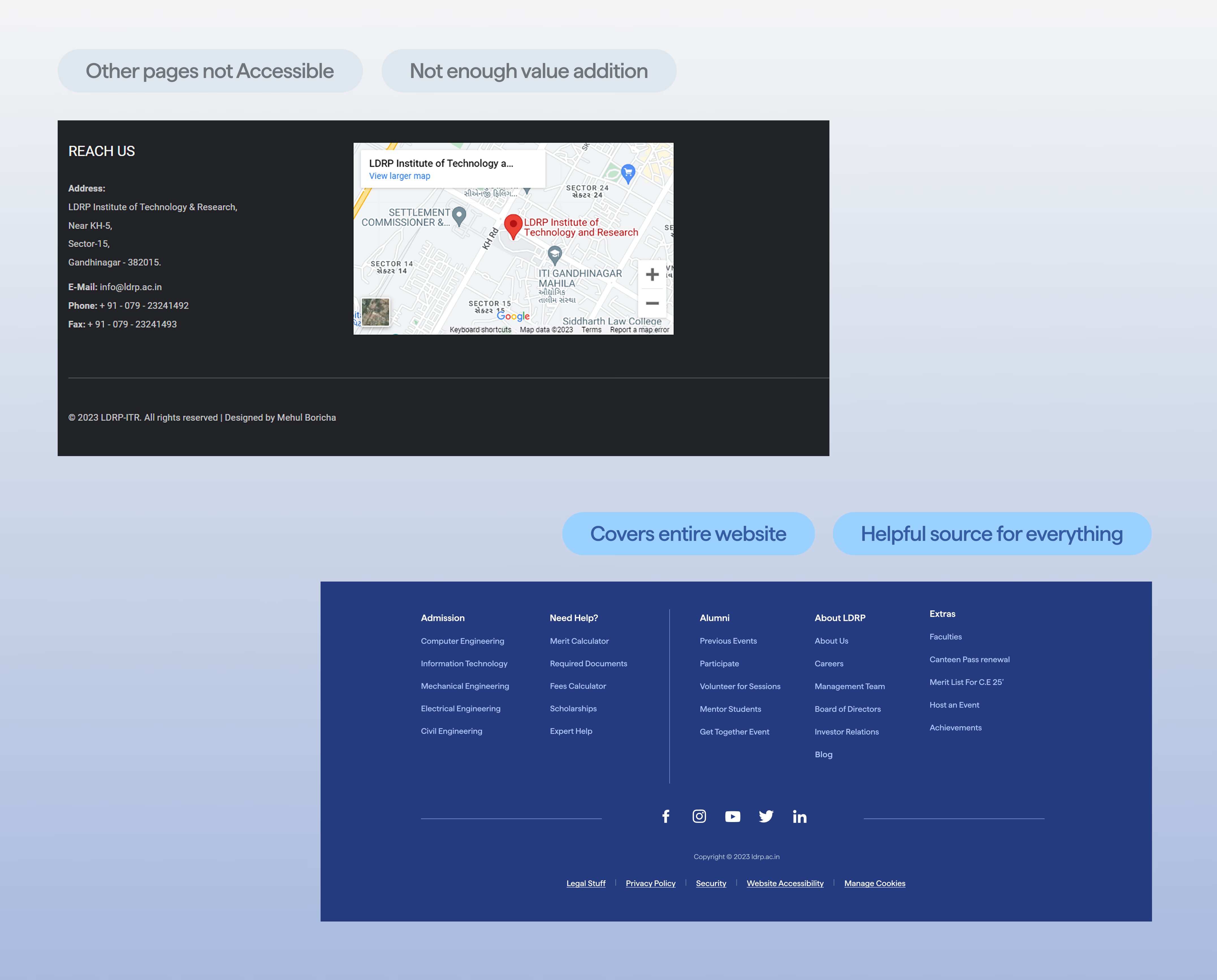
LDRP’s site buried the things people actually came for (syllabus, events, grades, admission docs) under an overloaded navigation. Current students gave up partway through tasks; prospective ones quietly doubted the institution.
In research, that distrust traced straight back to the design itself, not the university.
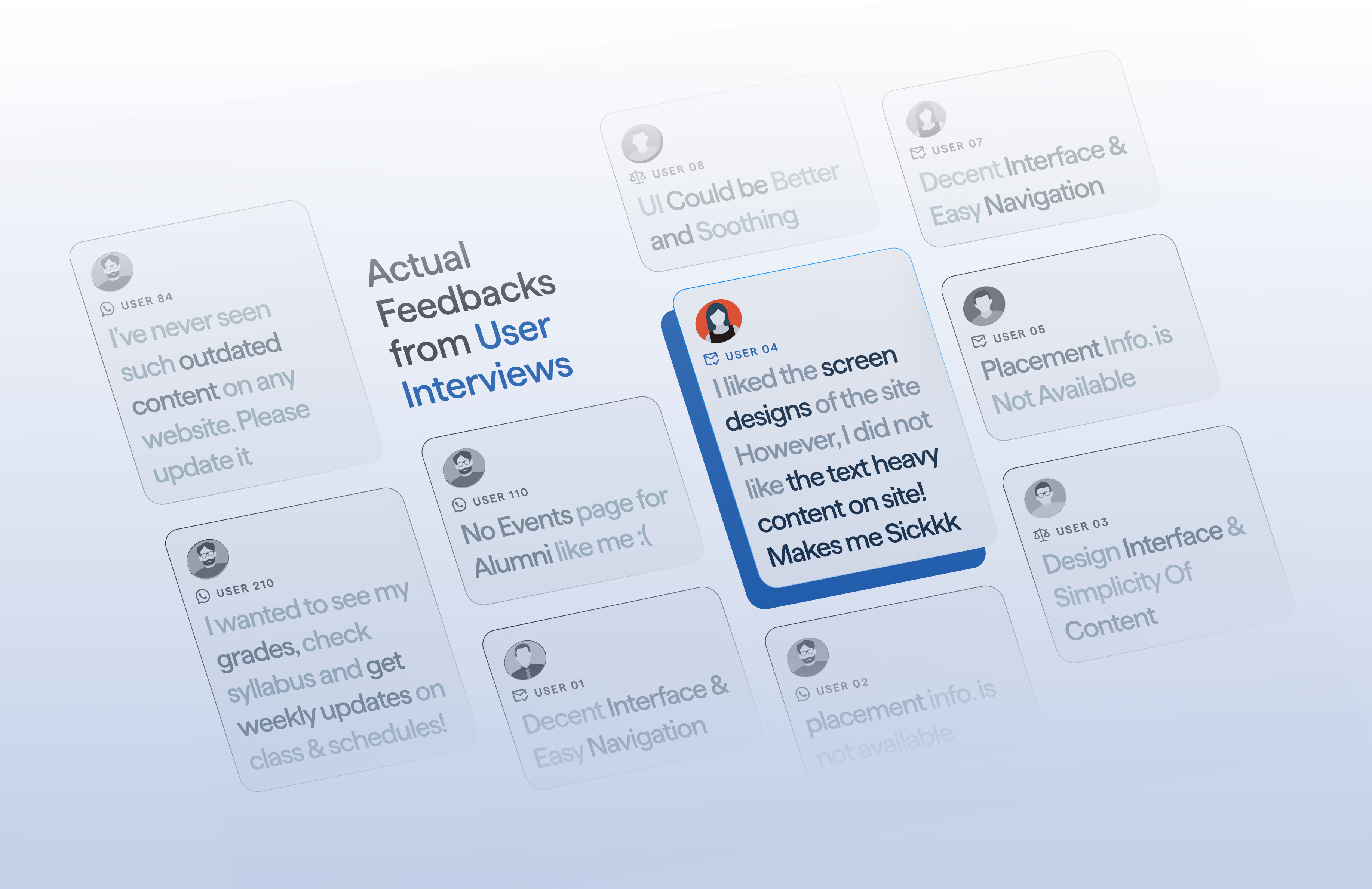
I ran it from research to redesign. Across surveys, usability tests, and interviews with 12 students plus a competitive teardown, one pattern dominated: the information was all there, but the navigation hid it.
I mapped how the three real audiences (student, alumni, parent) actually move through the site, then:
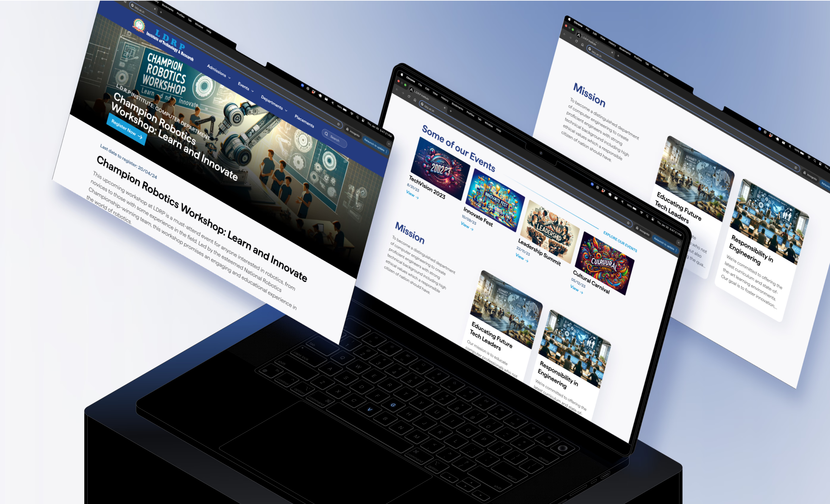
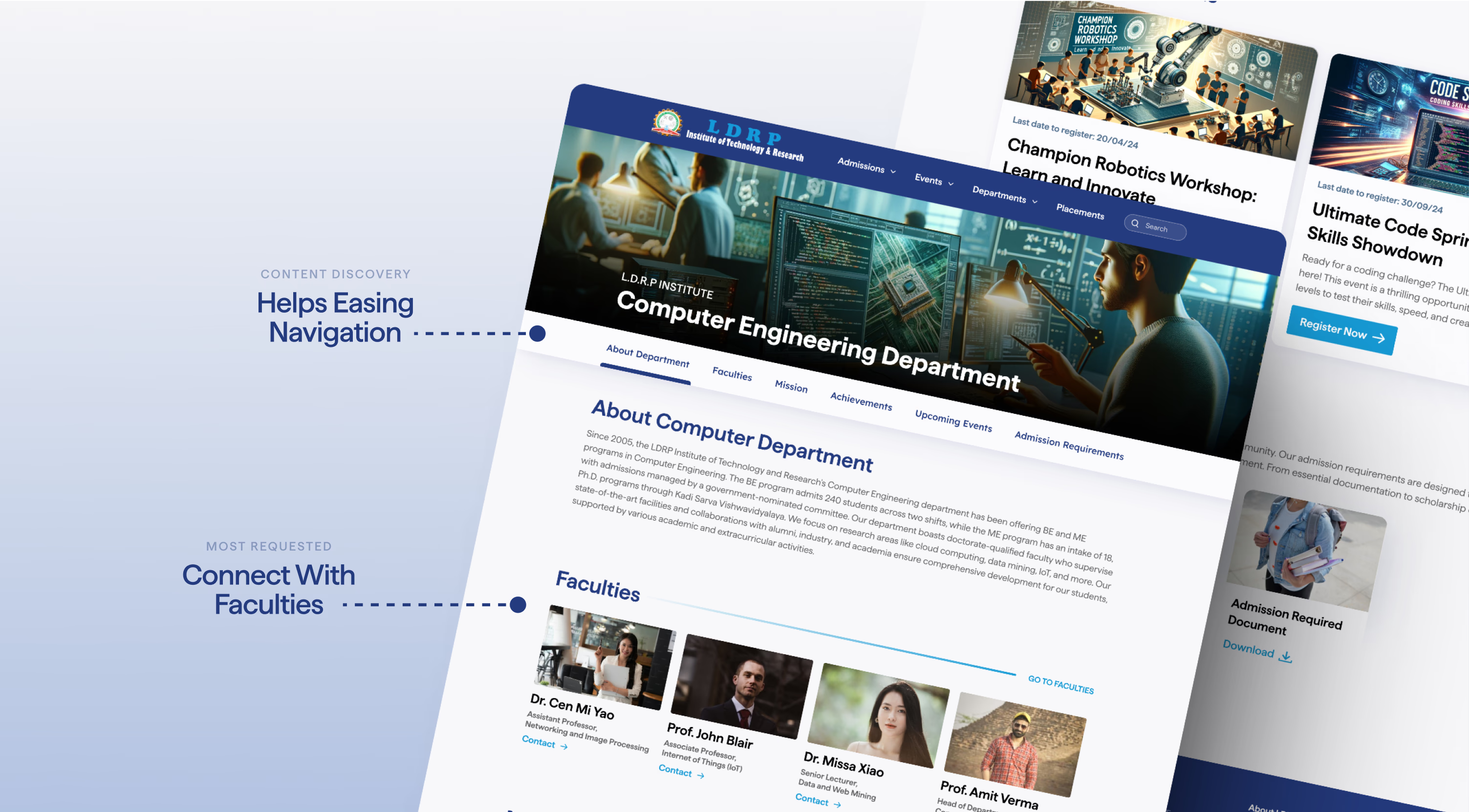
- Collapsed the bloated nav into a clear, categorized horizontal menu.
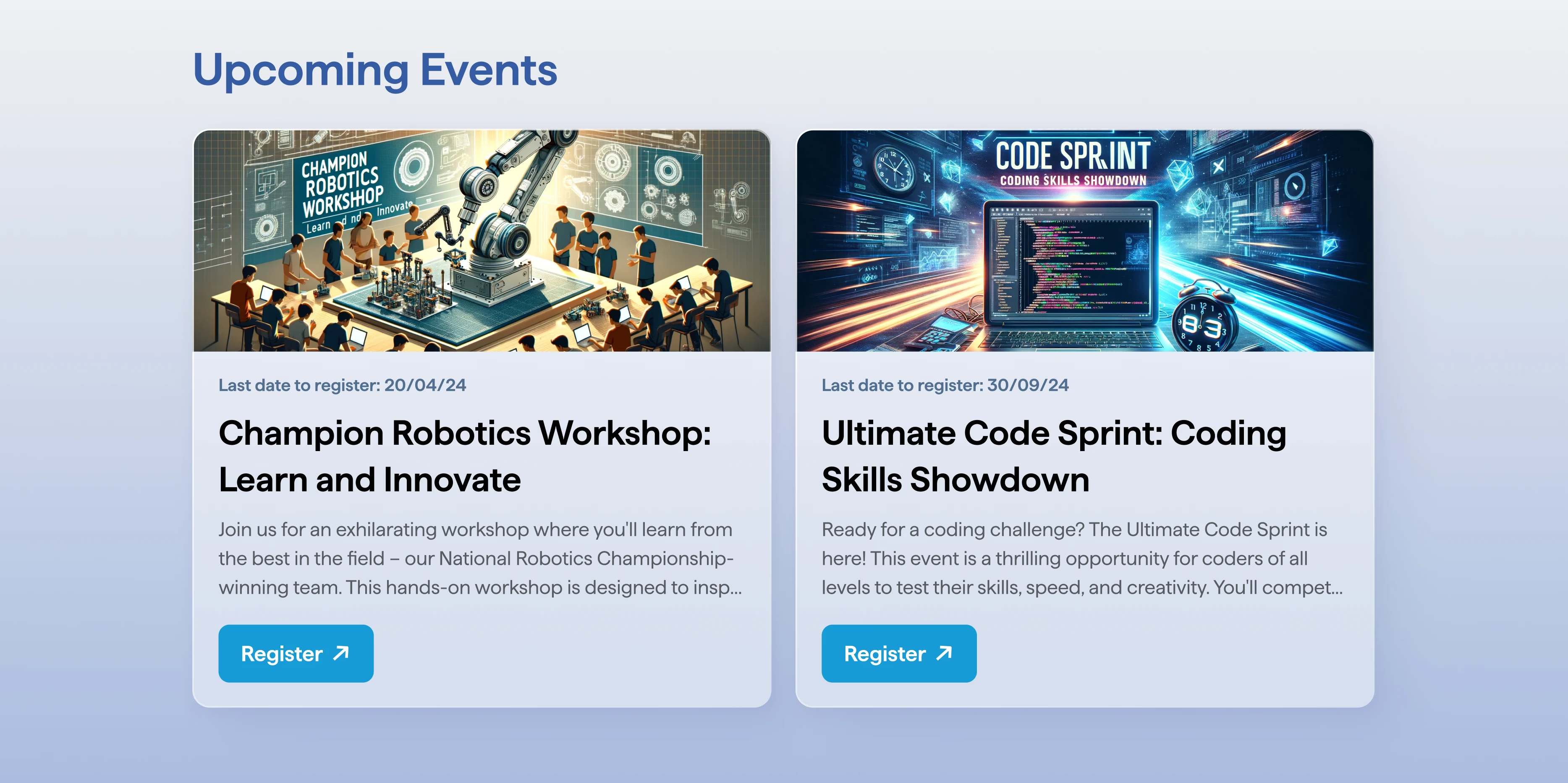
- Surfaced events on departmental pages.
- Got admission docs and syllabi within a couple of clicks.
In usability testing after the redesign, the wins were concrete and hard to argue:
- Task success climbed to about 90%.
- Time to find events dropped to 15 seconds.
- Time to reach required docs dropped to 25 seconds.
 Before
 After
After Before
 After
After Before
 After
After